
Also Read:
How to Enable a Responsive Mobile Template in Blogger
How To Add Google Adsense on Your Mobile Website
How to Hide/Show Blogger Widget on Mobile View
So here are the steps you need to follow in order hide or show blogger specific widgets on mobile view and customize your blog for different screens
.
.
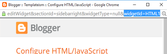
How to Find Widget ID in Blogger?
In case your blog is not showing any of your widget on mobile view, follow the instructions that we have mentioned below:Go to Blogger >> Template >> Layout. Now click on Edit button of widget which you want to show on your blogger template.
Now you need to look for Widget ID which would be in the URL of your selected widget. In the URL look for widgetId it would be towards the end of the URL. If you cannot find the Widget ID then simply Copy the title of the widget and if there is no title then give a title for time being, just for the sake of search.
Show Blogger Widget on Mobile View
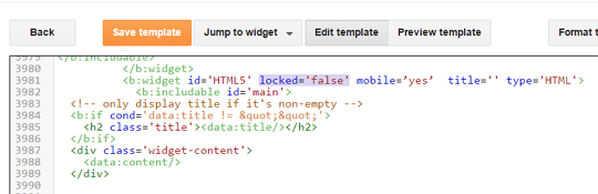
Go to Template >> Edit HTML >> Search for widget coding using Widget ID which you’ve copied in above step or widget title. (Quick Tip: You can use "Jump to widget" option available in template editor to get to the code of any widget that you like).This will straight take you to the widget coding, now add mobile=’yes’ in the widget code just after the locked=’false’. Refer the below screenshot to add it correctly.
Hide Blogger Widget for Mobile View
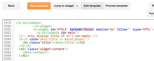
Go to Template >> Edit HTML >> Search for widget coding using Widget ID which you’ve copied in above step or widget title.This will lead you to the the widget coding, now add mobile=’no’ in the widget code just after the locked=’false’. Refer the below screenshot to add it correctly.
We hope this article helped you in learning how to show or
hide widget on mobile in blogger. If you have any queries or confusion left
related to this article then lend your queries in the comment box. Any of our
team members will assist you in solving them.
 About the Editorial Team
The Editorial Team of MyBloggerLab consists of a group of Professional Blogger geeks Led by Syed Faizan Ali (Founder of MyBloggerLab).


11 comments
Nice! Thank you for this. From this point, how can i position the widget where i want it.
Hi,
We will soon write a detailed tutorial on it, Thanks
Great post, but I tried to show my widget in mobile only with mobile=’only’ code, but it keeping error. "Error parsing XML, line 1382, column 53: Open quote is expected for attribute "mobile" associated with an element type "b:widget".
i try but errore....--> Kesalahan saat mengurai XML, baris 3972, kolom 48: Open quote is expected for attribute "mobile" associated with an element type "b:widget".
I also face the same prob. Pls guide ..how to fix it
i tried to do it but it shows following eror how to desolve it
Error parsing XML, line 1990, column 45: Element type "b:widget" must be followed by either attribute specifications, ">" or "/>"
correct code is mobile='yes'
Just go to the layout and drag the widget wherever you want in the layout. Thanks.
Hi,
You simply need a Responsive Blogger templates that adapts the same web design for the mobile users.
Have a Look at this template
http://www.templateism.com/2016/07/viral-mag-multipurpose-responsive-blogger-template.html
It has the same look and feel on mobile as well as on web.
It is also available for free Download.
It did work for me...But please tell us how to adjust widget??
CCan I use my phone to edit my html code?
Post a Comment
We’re eager to see your comment. However, Please Keep in mind that all comments are moderated manually by our human reviewers according to our comment policy, and all the links are nofollow. Using Keywords in the name field area is forbidden. Let’s enjoy a personal and evocative conversation.