
Recommanded Articles:
- How to Enable a Responsive Mobile Template in Blogger
- How To Make Your Website Responsive to Mobile Devices
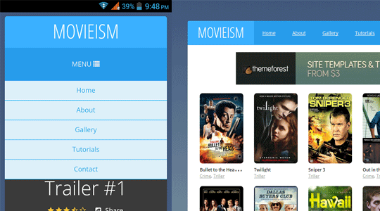
What is Responsive Menu?
Responsive menus are such navigation menus, which are flexible and user-friendly at the very same time. They provide a quality experience for both desktop users to mobile users. When on the desktop they appear the traditional way, but on mobile they appear just like a mobile application width, height and well arranged. In the following screenshot, you can clearly see the same menu appearing different on the desktop and on a smartphone.Live preview of this menu can be seen at this site http://movieismdemo.blogspot.com//
How to easily add a Responsive menu in Blogger?
When it comes to creating a responsive menu in blogger we have a variety of techniques on how to we can handle our navigation menus for small screen devices like mobile phones, smartphones and etc. The resources we have got to achieve this goal are endless. In this article, we will show a main concept that is easier to implement and have more advantages than disadvantages.The very first thing you need to do is to go to Blogger.com > Template > Edit HTML and paste the following code anywhere after <body> tag. (Keep in mind paste this code exactly where you would like to your menu to appear).
<!---Menu--> <nav id='nav-main'>
<ul>
<li><a href=''>Home</a></li>
<li><a href=''>About</a></li>
<li><a href=''>Gallery</a></li>
<li><a href=''>Tutorials</a></li>
<li><a href=''>Contact</a></li>
</ul>
</nav>
<div id='nav-trigger'>
<span>Menu <i class='fa fa-list'/></span>
</div>
<nav id='nav-mobile'/>
Now you to style the menu, you need to add the CSS to your template. To do so again in the template, search for }}]]></b:skin> tag and just below it paste the following code
#nav-trigger {
display: none;
text-align: center;
}
#nav-trigger span {
display: block;
background-color: #279CEB;
cursor: pointer;
text-transform: uppercase;
padding: 0 25px;
color: #EEE;
line-height: 67px;
}
nav#nav-mobile {
margin: 0px;
}
nav {
margin-bottom: 30px;
}
#nav-main {
background-color: #279CEB;
margin: 0px;
float: left;
}
#nav-main ul {
list-style-type: none;
margin: 0;
padding: 0;
text-align: center;
}
#nav-main li {
display: inline-block;
float: left;
ont-family: '
Open Sans'
, sans-serif;
}
#nav-main li:last-child {
border-right: none;
}
#nav-main a {
padding: 0 25px;
color: #EEE;
line-height: 67px;
display: block;
}
#nav-main a:hover {
background-color: #3AB0FF;
text-decoration: none;
color: #fff;
}
#nav-mobile {
position: relatifve;
display: none;
}
#nav-mobile ul {
display: none;
list-style-type: none;
position: absolute;
left: 0;
right: 0;
margin-left: auto;
margin-right: auto;
text-align: center;
background-color: #ddf0f9;
z-index: 10;
padding: 0px;
border-bottom: solid 1px #cc0028;
}
nav#nav-mobile li:last-child {
border-bottom: none;
}
nav#nav-mobile ul {
padding: 0;
margin: 0;
}
nav#nav-mobile a {
display: block;
color: #29a7e1;
padding: 10px 0px;
text-decoration: none;
border-bottom: 1px solid #00aeef;
text-align: center;
}
nav#nav-mobile a:hover {
background-color: #111;
color: #fff;
}
nav#nav-mobile li {
display: block;
}
nav#nav-mobile {
display: none;
}
/* =Media Queries
-------------------------------------------------------------- */
@media all and (max-width: 900px) {
#nav-trigger {
display: block;
}
#nav-main {
display: none!important;
}
nav#nav-mobile {
display: block;
}
}
After adding HTML and CSS core coding, without adding the following JavaScript code the menu would not work correctly. Therefore, add the following code just above the </head> tag.
<script type='text/javascript'>
//<![CDATA[
$(document).ready(function(){
$("#nav-mobile").html($("#nav-main").html());
$("#nav-trigger span").click(function(){
if ($("nav#nav-mobile ul").hasClass("expanded")) {
$("nav#nav-mobile ul.expanded").removeClass("expanded").slideUp(250);
$(this).removeClass("open");
} else {
$("nav#nav-mobile ul").addClass("expanded").slideDown(250);
$(this).addClass("open");
}
});
});
//]]>
</script>
Frequently Asked Questions:
Why when I click the Menu it doesn't open?Answer: Make sure you have followed the instructions mentioned above correctly. In case you are sure you have followed the steps correctly you might be missing a jquery.min.js file, while is must to trigger the menu on mobile. Go to Blogger >> Template >> Edit HTML >> search for <head> and just below it paste the following code:
<script src='https://ajax.googleapis.com/ajax/libs/jquery/1.5.1/jquery.min.js' type='text/javascript'></script>
We hope this tutorial will help everyone in learning how to easily add a responsive menu in blogger without facing much of worries. If you like this article, do share it with your friends.
 About the Editorial Team
The Editorial Team of MyBloggerLab consists of a group of Professional Blogger geeks Led by Syed Faizan Ali (Founder of MyBloggerLab).


32 comments
Just awesome...
Help me
Error parsing XML, line 1017, column 3: The element type "html" must be terminated by the matching end-tag "
Can you tell me on which step you're facing the error.
Sorry my English. The error is happening by the lack of a < div >.
this part:
< nav id = ' nav - mobile ' / >
< / div >
Just open the tag "div", therefore it is only closed.
< div >
< nav id = ' nav - mobile ' / >
< / div >
Moderator, fixes that part in the post. Thanks
Thank, the code is been fixed.
Can u help me
i cant find the" }}]]> tag" in the html. is it in the body or head?
It's in Head
Help me! I want this menu to appear only in the mobile version, what should I do?
thank you!
Use media queries
https://css-tricks.com/snippets/css/media-queries-for-standard-devices/
its not working, when i click on the menu it doesn't open
Please provide me blog url
same, when i click on the menu it doesn't open
In my blog (http://ruthalmada.blogspot.com.br/) isn't working too, the menu doesn't open
Thanks for the post, It worked for me only on homepage. Unfortunately the menu is not working for blog post.
Short this issue out..!!
It is not opening on mobile (not toogle!) I think on js there are some problem. Could you check my demo page ?
http://eb-pinardesserts.blogspot.de
We have updated the tutorial, follow it correctly and this time menu will work just fine.
A TIP:
Make sure your each blog post contains jquery.min.js file because it is essential to trigger the menu.
To add this file in each page. Go to Blogger >> Template >> EDIT HTML >> search for <head> and below it paste the following code:
<script src='https://ajax.googleapis.com/ajax/libs/jquery/1.5.1/jquery.min.js' type='text/javascript'></script>
Cheers
I checked your site, you are missing jquery.min.js file (Check Frequently asked questions above in the end of the post).
I have updated the tutorial, I would recommend you to remove all the codes you added before and re-apply the new codes correctly. This time it will work just fine.
Tutorial updated please apply again.
Hi,
Your jquery.min.js file is place at the end of the template which is a wrong approach and this is the reason why it is not working.
1. Go to Blogger >> Template >> Edit HTML >> Search for this
<script src='//ajax.googleapis.com/ajax/libs/jquery/1.11.0/jquery.min.js'></script>
2. After finding the above code, Copy it. and Remove it.
3. Now Look for <head>, and paste the code you copied just below <head>.
4. Save Template.
IMPORTANT: We have updated the CSS codes, Please update the CSS codes to make it work better.
I made it now but no change. Could you check again my demo ?
http://eb-pinardesserts.blogspot.de
Thanks
Working fine for me.
Now its working, thank you!
Thanks, menu ok
I want to use this widget at a particular navigation bar how can i do that?
I have a CSS drop-down menu on blogger that I'd like to make mobile-friendly, can you post a generic blog entry about how to take an existing menu and apply this approach to it?
Thx,
Mike
Thank you so much! this was super helpful, well explained and perfect for what i needed!
Thank you so much! It works perfectly ;)
Not working in my mobile, even tried to put the code just BELOW [head]
Also, it changed my navbar to vertical. What a mess :(
Did you add the Code correctly? Because it should only work for mobile users not desktop users?
Can you please provide me your blog URL?
Cheers
how to hide this code for desktop and only work for mobile view
Is there a way to make the menu on mobile view a bit bigger? (Using CSS, perhaps?) Thanks! :)
Could you resolve this issue? I have the same. Now I have two Navigations in my blog.
Post a Comment
We’re eager to see your comment. However, Please Keep in mind that all comments are moderated manually by our human reviewers according to our comment policy, and all the links are nofollow. Using Keywords in the name field area is forbidden. Let’s enjoy a personal and evocative conversation.